top of page


Programs Used /
Adobe XD
Illustrator
Photoshop
After Effects
Google Docs
Miro
Trello
My Role /
Design Lead
Project Management
Task Delegation
User Interviews
Usability Testing
Heuristics & Accessibility
User Interface Design
Motion Design
Team /
Jerry Qu, Chuck Bourg, Shelagh Bennett
Platforms /
iOS
Date /
June, 2021

The Problem
Fulton seeks to improve the overall experience of their current website by finding the most effective ways to educate their customers about the product’s value and increase sales
The Problem
Project Parameters
These four elements make up the most significant design criteria.
Heuristics
& Accessibility
To assess the current website and uncover usability issues.
Promotion of Wellness
To empower users to improve their alignment.
Sustainability
Inform users of the product's eco-friendly materials.
Agile UX
Design of features built through team collaboration and customer feedback

Plan of Action
To begin working on a solution, we needed to pinpoint the cause of the problem. To do so, we gained access to Fulton's analytic information via Google Analytics and then conducted a heuristics evaluation and an accessibility audit on Fulton’s current site.
The mobile website had both the most traffic and the highest bounce rate.
So we decided to redesign the Fulton website from the ground up mobile-first.
How Might We . . .
Quickly and easily inform the user about the product and its benefits
Re-organize the overall information architecture so that the website displays all of the important information closer to the product

Information Architecture
The most cluttered part of Fulton's original website was its home page, which doubled as its Shop page; it also housed the FAQ, Contact, Press, Reviews, and physiological science behind alignment.
To tackle this challenge, everybody on our team split up to ideate possible solutions, then met up again to create the most logical sitemap. We planned to use iconography to reduce cognitive load and inserted webpages only accessible from the home page but do not appear in the navigation menu.
We sorted user quotes feedback into an affinity map on Miro

IA Design
UI Design
User Flows
The ‘Red Route’ is the most critical task performed by users. The website cannot function without it. ‘Normal Routes’ are secondary tasks that are important but not critical.
%20-%20Make%20a%20Purchase.jpg)
%20-%20See%20Photos.jpg)
%20-%20Read%20Articles.jpg)
%20-%20Read%20Reviews%20.jpg)
Sketches
Once we finalized the sitemap, we split up to visualize possible screens and layouts on paper. On the next day, we ran a critique on each other’s designs and combined our favorite elements into this ‘Frankenstein’ of a sketch.

Low Fidelity Wireframes
After Chuck drew up low-fidelity screens based on our collective sketch, I created simple interactions and linked the screens into a clickable prototype in preparation for our second round of usability testing.

Information
Rich but scannable.
CTAs
Intuitive and straightforward
Content
User reviews and navigation could improve.


Animation
360 Product Visualization
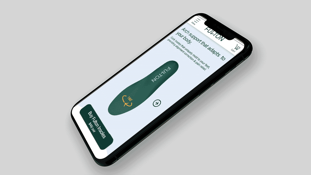
Red Route: Make a Purchase
Iconography

UI Elements


bottom of page