top of page


GOOGLE VENTURES DESIGN SPRINT
CityPups
CityPups is a new startup that wants to help people living in cities find the perfect dog to adopt.
My goal is to increase user confidence so that more users follow through with the adoption process.
Programs Used /
Adobe XD
Illustrator
Photoshop
Google Docs
Google Slides
My Role /
Sprint Management
Usability Testing
User Interface Design
User Testing
Team /
Jerry Qu
Platforms /
Web
Date /
April, 2021
Day 1:
Understand / Map
Prospective adoptees abort because websites lacked the information for a well-informed decision:
exact age
health issues
level of energy
good with children
comfortable in crowds
the hustle of bustle of city life
comfortable around other pets
How might we help people who live in cities find their perfect adoption dog?

Above: Possible end-to-end map of user experience
Day 1
Day 2
Day 2:
Sketch the Solution
Lightning Demos:
Lightning Demos help to formulate ideas by exploring solutions competitors have produced to solve similar problems.
AdoptUSKids
Child adoption has a longer history so I analyzed their search flow for solutions.
-
Brief questionnaire acts like a search filter.
Layout was text-heavy and lacked visual elements.
Zillow
House-hunting websites use similar search flows.
-
Search bar has categories of filters that could narrow down results.
Text-heavy info increases cognitive load.
Petfinder
Popular pet adoption site with a large database of dogs, cats, and others.
-
Filters accessible at all times in left column.
-
Pet profiles have 'Meet' sections that detail behaviors.
Crazy 8s:
Crazy 8s help formulate ideas by sketching out eight variations of the most critical screen within eight minutes.

Above: Crazy 8 Sketches
Solution Sketch:
I picked the best critical screen from the Crazy 8s and sketched the screen that comes before and after.

Above: Homescreen, Filters, and Results
Day 3:
Storyboard
I started with the home screen, where the search function would first appear.
I worked towards the Solution Sketch from Day 2 and ended with the dogs' profile page.

Above: Storyboard is read top to bottom, left to right
Day 3
Day 4:
Prototype
It made sense to set the primary color to purple because purple symbolizes loyalty and trust. The prototype takes the user from the home screen to a pet's profile page.
Step 1:
Users enter their location and click Search.

Above: Homescreen
Step 2:
Users narrow down results by choosing from typical to more specific filters:
gender, age, distance, weight | energy level, minimum space required
Above: Search filters
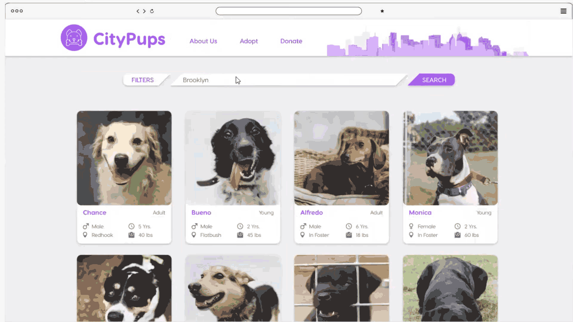
Step 3:
Once applied, filtered results are more relevant to the users.
Cards show a preview of gender, location, age, and weight.

Above: Filtered search results
Step 4:
The expanded pet profile shows basic info about their gender, location, age, weight, health, animals they get along with, animals they should avoid, and adoption fees.
Below the basic info is a paragraph about their personality, recommended living environment, and energy level. A gallery features videos and photographs.

Above: Pet profile page
Day 4
Day 5
Day 5:
Validate
User Testing
I conducted interviews with five participants via Discord.
Three live in European cities, two live in American cities.
Navigation
Users thought the website prototype was intuitive to use. The layout reduced cognitive load, allowing users to focus on their goals.
Search
Users felt the search filters had covered all of their concerns. Many of which are not addressed by the pet adoption websites.
Pet Profile
Users felt they could quickly find their perfect dog, and they were fully confident about moving forward with the adoption process.

Left: Screenshot of participant 1 testing via Discord
Below: Screenshot of participant 2 testing via Discord

bottom of page